Just a few years back websites were exclusively created for desktop computers. If you were trying to navigate a website with your mobile device, you had to deal with very small and unreadable fonts and zoom in and out repeatedly in order to read the content. Responsive web design is a set of techniques for creating websites that look good on mobile devices as well as large desktop screens.
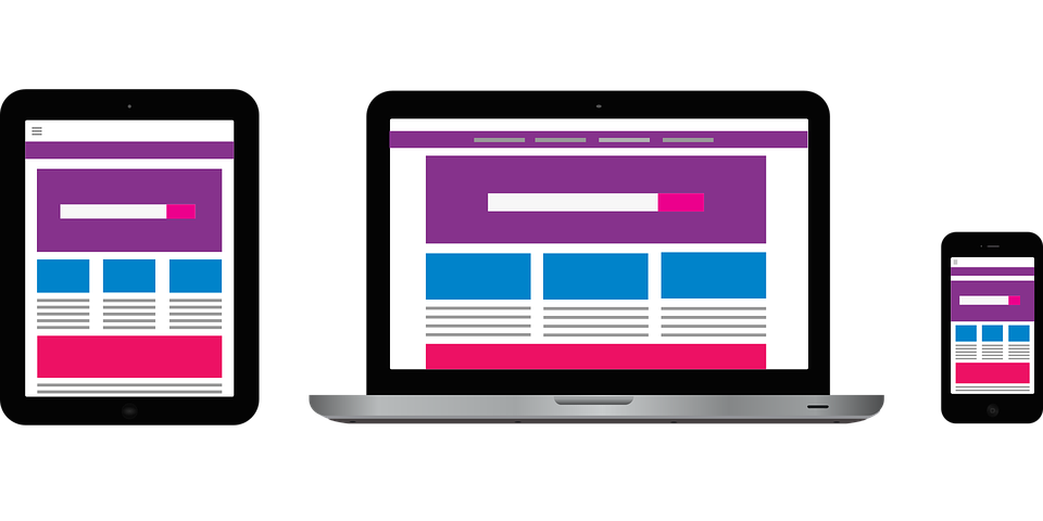
What responsive design does
A responsive website adjusts its content automatically to fit various screen sizes and still looks beautiful and readable. Here is a simple example, suppose you have a news website, when your responsive news site is read from a desktop you will see:
- Headlines
- Sub headings
- Snippets of content
However, when the same website is viewed from a smart phone, it adjusts its content, so it will only show the headlines which link to the respective content. This makes it easier for the viewer to browse the site more effectively and find what they are looking for. This same concept applies to all varieties of websites.
If you have a website based on responsive design:
- It allows people to view the same website from multiple devices without issues.
- Makes your life easier because you don’t have to maintain two different versions of your website.
- Your website gets better rankings on search engines because they prefer mobile friendly websites.
Getting responsive design right
Responsive design provides a great solution, though it is not easy to achieve. In order to create this solution and have it work 100% reliably, you need a proficient web developer to code your website. Creating a new mobile website is much cheaper these days than it used to be even 2 or 3 years ago.